


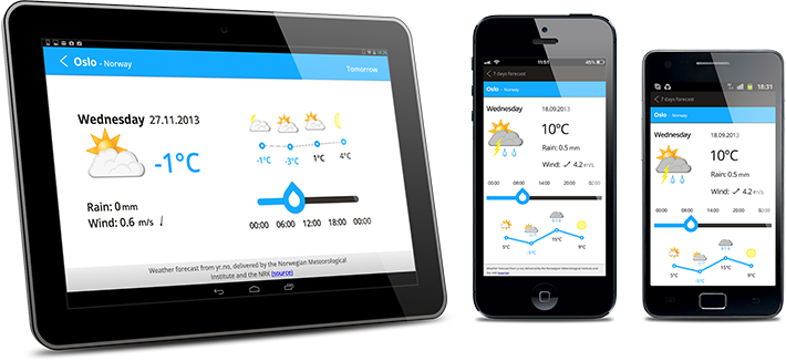
Qt Quick contains features that enable you to develop apps that can run on different types of devices, such as tablets and handsets. In particular, the apps can cope with different screen configurations: size, density, orientation, resolution, and aspect ratio.
To implement scalable applications using Qt Quick:
- Design UIs using Qt Quick Controls that provide a set of UI controls for creating application windows and their standard parts, such as a menu bar, tool bar, and a status bar. The size constraints of the content items are taken as input when calculating the effective size constraints of the actual window. Additional controls are provided for creating views and menus, as well as presenting or receiving input from users. You can use Qt Quick Controls Styles to apply custom styling to the predefined controls.
- Define layouts using Qt Quick Layouts, which can resize their items. You can position screen controls in a row, column, or grid.
- Use property binding to implement use cases not covered by the layouts. For example, to display alternative versions of images on screens with low and high pixel density or automatically rotate view contents according to the current screen orientation.
- Load platform-specific assets using file selectors.
- Load components on demand by using a Loader.
These features are described in more detail in Qt 5.3 documentation. We would now like to collect feedback from developers to find out how well the current features fit your needs and how we could improve them and the documentation. Please tell us about your experiences in developing scalable Qt Quick apps in the comments. If you have suggestions or feature requests, add them as subtasks of the Improve UI Scalability task (QTBUG-38858) in the Qt Bug Tracker. Also, keep reporting the bugs that you find and link them to the task.