

この記事は The Qt Blog の Let There Be More Shapes! を翻訳したものです。
執筆: Laszlo Agocs, 2017年8月10日
Shape エレメントを紹介した前回の記事 に引き続き、今回は 5.10 に追加されるさらなる機能について紹介しようと思います。
Shape エレメントの最初のバージョンでは線形のグラデーションのみがサポートされていました。しかし、放射状のグラデーションと円錐状のグラデーション(これらはすでに QPainter ではサポートされているため、これを実現するためのフラグメントシェーダーはすでに存在するので、このつなぎ込みのみが必要です)が無いため不完全だという社内外からのフィードバックがありました。これを受けて、RadialGradientと ConicalGradientのパッチがすべてマージされました。(紛らわしいことに QtGraphicalEffects にも似たような名前のエレメントが存在しますが、今回のは QtQuick.Shapes 1.0 で利用可能です。)
では実際に見てみましょう。前回と今回紹介したコードはすべて こちらのリポジトリ に存在します。
1. 放射状のグラデーション
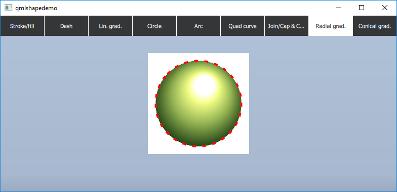
Shape {

    id: radGradCirc

    anchors.fill: parent

    property real r: 60
    ShapePath {

        strokeWidth: 4

        strokeColor: "red"

        fillGradient: RadialGradient {

            centerX: 100; centerY: 100; centerRadius: 100

       	    SequentialAnimation on focalRadius { ... }

            SequentialAnimation on focalX { ... }

            SequentialAnimation on focalY { ... }

            GradientStop { position: 0; color: "#ffffff" }

            GradientStop { position: 0.11; color: "#f9ffa0" }

            GradientStop { position: 0.13; color: "#f9ff99" }

            GradientStop { position: 0.14; color: "#f3ff86" }

            GradientStop { position: 0.49; color: "#93b353" }

            GradientStop { position: 0.87; color: "#264619" }

            GradientStop { position: 0.96; color: "#0c1306" }

            GradientStop { position: 1; color: "#000000" }

        }

        strokeStyle: ShapePath.DashLine

        dashPattern: [ 1, 4 ]
        startX: radGradCirc.width / 2 - radGradCirc.r

        startY: radGradCirc.height / 2 - radGradCirc.r

        PathArc {

            x: radGradCirc.width / 2 + radGradCirc.r

            y: radGradCirc.height / 2 + radGradCirc.r

            radiusX: radGradCirc.r; radiusY: radGradCirc.r

            useLargeArc: true

        }

        PathArc {

            x: radGradCirc.width / 2 - radGradCirc.r

            y: radGradCirc.height / 2 - radGradCirc.r

            radiusX: radGradCirc.r; radiusY: radGradCirc.r

            useLargeArc: true

        }

    }

}
2. 円錐状のグラデーション
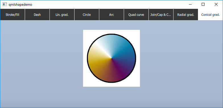
Shape {

    id: conGradCirc

    anchors.fill: parent

    property real r: 60
    ShapePath {

        strokeWidth: 4

        strokeColor: "black"

        fillGradient: ConicalGradient {

            centerX: 100; centerY: 100

            NumberAnimation on angle { ... }

            GradientStop { position: 0; color: "#00000000" }

            GradientStop { position: 0.10; color: "#ffe0cc73" }

            GradientStop { position: 0.17; color: "#ffc6a006" }

            GradientStop { position: 0.46; color: "#ff600659" }

            GradientStop { position: 0.72; color: "#ff0680ac" }

            GradientStop { position: 0.92; color: "#ffb9d9e6" }

            GradientStop { position: 1.00; color: "#00000000" }

        }
        // ... the actual shape is the same as in the previous example

    }

}