


With the release of Qt 5.3, the Calendar control was added to Qt Quick Controls, providing a Qt Quick counterpart to QCalendarWidget. Although it is still quite a young control, Calendar can already cover many use-cases. We'll show an example of Calendar used in a touch application. Note that a CalendarStyle has not yet been written for touch devices (styling for Android is currently in the works). Thanks to the versatile styling API, however, we can do this ourselves.
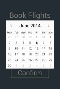 The Calendar control.
Our example is a flight booking app. For simplicity's sake, you can't choose where you're going; let's call that a feature.
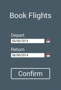 The main screen.
We chose to create a combined date edit and popup calendar, as is common for flight booking interfaces. Below we show the usage of Calendar in the app:
Calendar {

    id: calendar

    parent: window.contentItem

    visible: false

    z: focusShade.z + 1

    width: parent.width * 0.8

    height: width

    anchors.centerIn: parent
focus: visible
onClicked: visible = false
Keys.onBackPressed: {
event.accepted = true;
visible = false;
}style: TouchCalendarStyle {
}
}
Firstly, we parent the Calendar to the window's contentItem because we want it to appear above everything, including the "focus shade" that hides the rest of the app behind a dark tint. We then assign a width that fits nicely within the screen, and a matching height to make it perfectly square. Calendar handles resizing gracefully, using an algorithm that results in smart allocation of space for each cell.
For closing the calendar pop-up after selecting a date, we respond to the clicked() signal, and to cancel the popup, Keys.backPressed(). Remember that items must have focus before they are able to respond to input. The selectedDate property holds the current date shown by the calendar, and by default, it is set to today's date.
Now, on to the styling:
CalendarStyle {

    navigationBar: Rectangle {

        color: "#f9f9f9"

        height: dateText.height * 2
        Rectangle {

            color: Qt.rgba(1, 1, 1, 0.6)

            height: 1

            width: parent.width

        }
        Rectangle {

            anchors.bottom: parent.bottom

            height: 1

            width: parent.width

            color: "#ddd"

        }

        ToolButton {

            id: previousMonth

            width: parent.height

            height: width

            anchors.verticalCenter: parent.verticalCenter

            anchors.left: parent.left

            iconSource: "qrc:/left-angle-arrow.png"

            onClicked: control.showPreviousMonth()

        }

        Label {

            id: dateText

            text: styleData.title

            font.pixelSize: defaultFontPixelSize * 1.5

            horizontalAlignment: Text.AlignHCenter

            verticalAlignment: Text.AlignVCenter

            fontSizeMode: Text.Fit

            anchors.verticalCenter: parent.verticalCenter

            anchors.left: previousMonth.right

            anchors.leftMargin: 2

            anchors.right: nextMonth.left

            anchors.rightMargin: 2

        }

        ToolButton {

            id: nextMonth

            width: parent.height

            height: width

            anchors.verticalCenter: parent.verticalCenter

            anchors.right: parent.right

            iconSource: "qrc:/right-angle-arrow.png"

            onClicked: control.showNextMonth()

        }

    }
The navigationBar component styles the bar at the top of the calendar that, by default, contains the next month/previous month buttons and the selected date label. As with all of the components, you're free to put whatever you like there - we just define the layout of the components within the control, but you define the content. We start with some cosmetic lines using 1-pixel-thick Rectangle items, and then place two ToolButtons for next and previous month navigation. Calendar offers several methods of navigation:
- Keyboard input - via the left/right/up/down/home/end/page up/page down keys.
- Mouse and touch input - clicking a cell will select that date, and if that cell happens to be from an earlier or later month, that month will be made visible.
- Programmatic input - either set the selectedDate, which both changes the selected date and moves to that month and year, or use one of the properties or functions that only navigate to a certain month and year, without selecting it: visibleMonth, visibleYear, showPreviousMonth(), showNextMonth(), showPreviousYear(), showNextYear().
    dayOfWeekDelegate: Rectangle {

        color: gridVisible ? "#fcfcfc" : "transparent"

        Label {

            text: Qt.locale().dayName(styleData.dayOfWeek, control.dayOfWeekFormat)

            font.pixelSize: defaultFontPixelSize * 0.8

            anchors.centerIn: parent

        }

    }
The dayOfWeekDelegate component styles each weekday cell in the "header" of the calendar. To ensure that everyone, regardless of language, can book flights with us, we format the days of the week using the application's default locale.
You may have noticed that we're scaling font sizes; this is because different devices will have different resolutions, and we need to account for this. If you're content with using the default font size provided by text items, then Qt will choose an appropriate size for the target device. However, if you want some text to be larger and some smaller, things get trickier, because a hard-coded font size will result in text that varies in size depending on the screen it is viewed on. To have the best of both worlds, we take the font size that Qt thinks is appropriate and then multiply by some factor to increase or decrease the size.
    dayDelegate: Rectangle {

        Label {

            text: styleData.date.getDate()

            anchors.centerIn: parent
            readonly property color sameMonthDateTextColor: "#444"

            readonly property color selectedDateTextColor: "#111"

            readonly property color differentMonthDateTextColor: "#bbb"

            readonly property color invalidDatecolor: "#dddddd"
            font.underline: styleData.selected
            color: {

                var color = invalidDatecolor;

                if (styleData.valid) {

                    // Date is within the valid range.

                    color = styleData.visibleMonth ? sameMonthDateTextColor : differentMonthDateTextColor;

                    if (styleData.selected) {

                        color = selectedDateTextColor;

                    }

                }

                color;

            }

        }

    }

}
The dayDelegate component styles each date in the calendar's grid. There are many properties exposed to this component by CalendarStyle to make the styling process easier. We've also given each color a readonly property to make the code clearer.
There you have it. A touch-friendly calendar, ready for the world! You can find the full example project here.
If you'd like to get an overview of where these components lie within the calendar, please take a look at the brightly colored Component Map. For more information about the Calendar control, head over to the Calendar and CalendarStyle documentation. For a desktop-oriented example, see the Qt Quick Controls - Calendar Example.