


As most of you already know, Qt Quick Controls allow you to save time developing user interfaces by utilizing a library of ready-made controls with different styles which you also can easily customize to your liking. The Qt Quick Controls 2 module delivers the next generation UI controls with a great performance boost.
The feature freeze of Qt 5.8 was a while back, and the 5.8 beta release is being prepared as we speak. Let's take a brief look at what's coming in Qt Quick Controls 2.1 in Qt 5.8.
In the first release of Qt Quick Controls 2, we made a deliberate choice to focus on the areas that the first generation Qt Quick Controls were not able to serve well: embedded and mobile. The next release introduces a few features that improve the behavior of the new controls on traditional desktop platforms.
Hover Effects
Hover effects have been one of the most popular feature requests. We have had the enablers already in place, meaning that it has been possible to implement hover effects for your own custom controls and styles, but the hover effects for the built-in styles did not make it to the first release. I'm happy to announce that the Material and Universal styles have gained hover effects in Qt 5.8. This alone makes the controls more pleasant to use on platforms with a mouse pointer. Check the following video to see how the Universal style hover effects look.
https://www.youtube.com/watch?v=43HrMH379-E
Ripple Effects
While working on the hover effects, it became apparent that we would also like to have ripple effects for the Material style. Take a look at the following screencast to see what we have cooked up.
https://www.youtube.com/watch?v=12F3JSxUMfY
System Theme
We have also introduced a new theme option for the Material and Universal styles. The new theme is called System, and it simply resolves to either the light or dark theme based on the system theme colors. This feature is opt-in, because it typically takes some extra consideration to make applications look good in both light and dark themes. For example, if you use icons in your application, you may have to ship both light and dark versions.
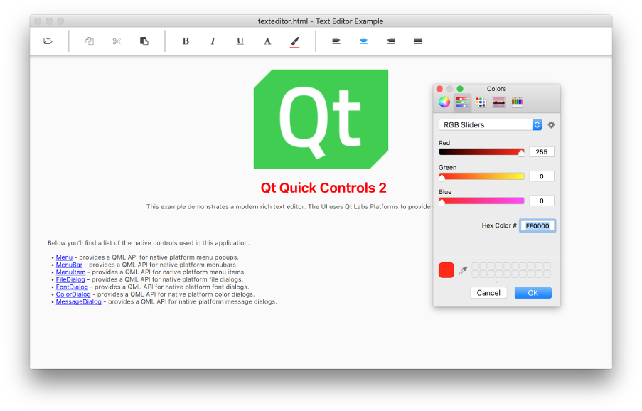
Platform Types
Another thing we have been working on is a new module that provides a set of experimental "platform" types. These QML types are light-weight wrappers for the native menu, menubar, standard dialog, and system tray icon implementations provided by the Qt Platform Abstraction layer. For the time being, since not all platforms have implementations of all of these native types in place, Qt Widgets are used as a fallback when a native implementation is not available. The platform types integrate seamlessly with Qt Quick, but unlike the heavily customizable Qt Quick Controls, the platform types are not customizable using Qt Quick primitives. Inspired by the good old example by the same name in Qt Quick Controls 1, we have implemented a new Text Editor example that offers a modernized look'n'feel and showcases the platform types.
New Controls
There are a few new QML types in the core Qt Quick Controls 2 offering too. While we were implementing the Text Editor example, we realized that it would be nice to have ready-made separators that play nice with the built-in styles and themes. We ended up introducing MenuSeparator and ToolSeparator, that are designed to be used in Menu and ToolBar, respectively.
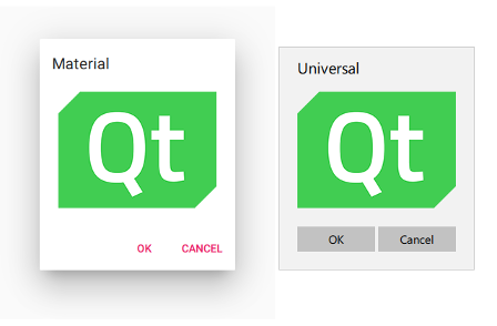
We have also added a new Dialog popup that offers the same convenient "header-content-footer" layout found in ApplicationWindow and Page. Dialog uses DialogButtonBox, which is also offered as a standalone type, to let you configure a set of standard buttons in a breeze.
Last but not least, our latest family member is RoundButton. Customizing Button to have a round background was a popular question on various forums. Even though it is straight-forward to customize the background, it means losing the default background, which looks different for different styles. We decided to offer a control that does this out of the box. The Material style version of RoundButton supports elevation, so it can be easily used to create a Floating Action Button. We have used RoundButton in the touch UI of the Text Editor example for triggering the edit mode.

What's Next?
Qt Quick Controls 2 already offers many features Qt Quick Controls 1 never had, but there are still a few smaller and larger features that are, in comparison to the old set, still missing from the new controls. We don't have an exact time schedule to offer for each feature, but we'll continue catching up with the rest, version by version. For example, editable ComboBox is something that we have already started working on, and if everything goes well, it is going to be introduced in Qt Quick Controls 2.2 in Qt 5.9. Some notable missing features from Qt Quick Controls 1 are Action, SplitView, TableView, and TreeView.
Other items on the wish-list are Pickers, SegmentedButton, persistent Drawer, floating/transient headers and footers, action bar, pull-to-refresh, multi-touch support, perhaps some new styles... well, a lot of things. We won't run out of ideas for a while. :) If you have some other great ideas, please don't hesitate to send us a suggestion!
In other news, Mitch and I are delivering an online presentation about Qt Quick Controls 2.1 on October 11th. Register for the webinar today to learn more!
At the Qt World Summit, there will be two presentations related to Qt Quick Controls 2. Shawn will be talking about developing user interfaces with Qt Quick Controls 2, and Ekke is going to present how he built the Qt World Summit Conference App using Qt Quick Controls 2.