


Back in April we wrote about image-based styling for Qt Quick Controls 2. Since then, we have made good progress and nailed down some aspects that were still under consideration. We call the new style "Imagine".
[embed]https://youtu.be/WGmjObx6AkM[/embed]
The style works by scanning a directory of images and applying those images to the controls. For example, when a Button is created, the style will look for button-background.9.png (or button-background.png for non-resizable buttons). As an example of what that image could look like, here's button-background.9.png from the default assets:
When the user presses the button, the style then looks for button-background-pressed.9.png (or button-background-pressed.png). In the case of the default assets, that would look like this:
The .9.png extension represents 9-Patch images. Using this format, we're able to encode information about how the control should look when it is resized into the image itself. Combine this with the pre-defined file naming convention and you've got a style that can be customized without ever touching QML, giving designers complete control over what they do best, and allowing developers to focus on writing applications, not styles.
To provide a starting point for creating your own style, we've created a complete asset template in Sketch:
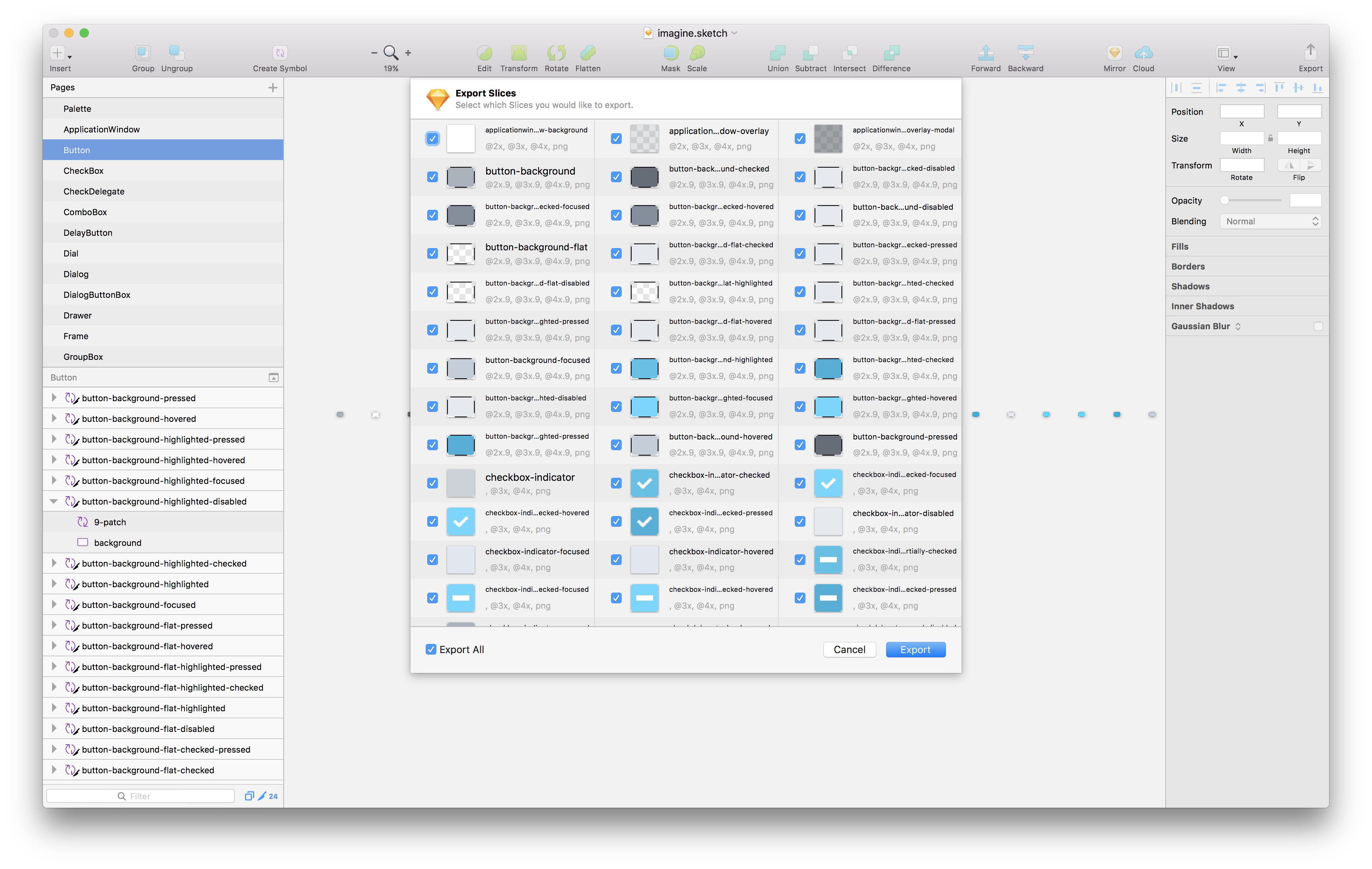 Default Imagine style Sketch template (
Sketch)
Default Imagine style Sketch template (
Sketch)
For those who prefer Illustrator or Photoshop, we've provided smaller templates, each with their own example that uses the assets:
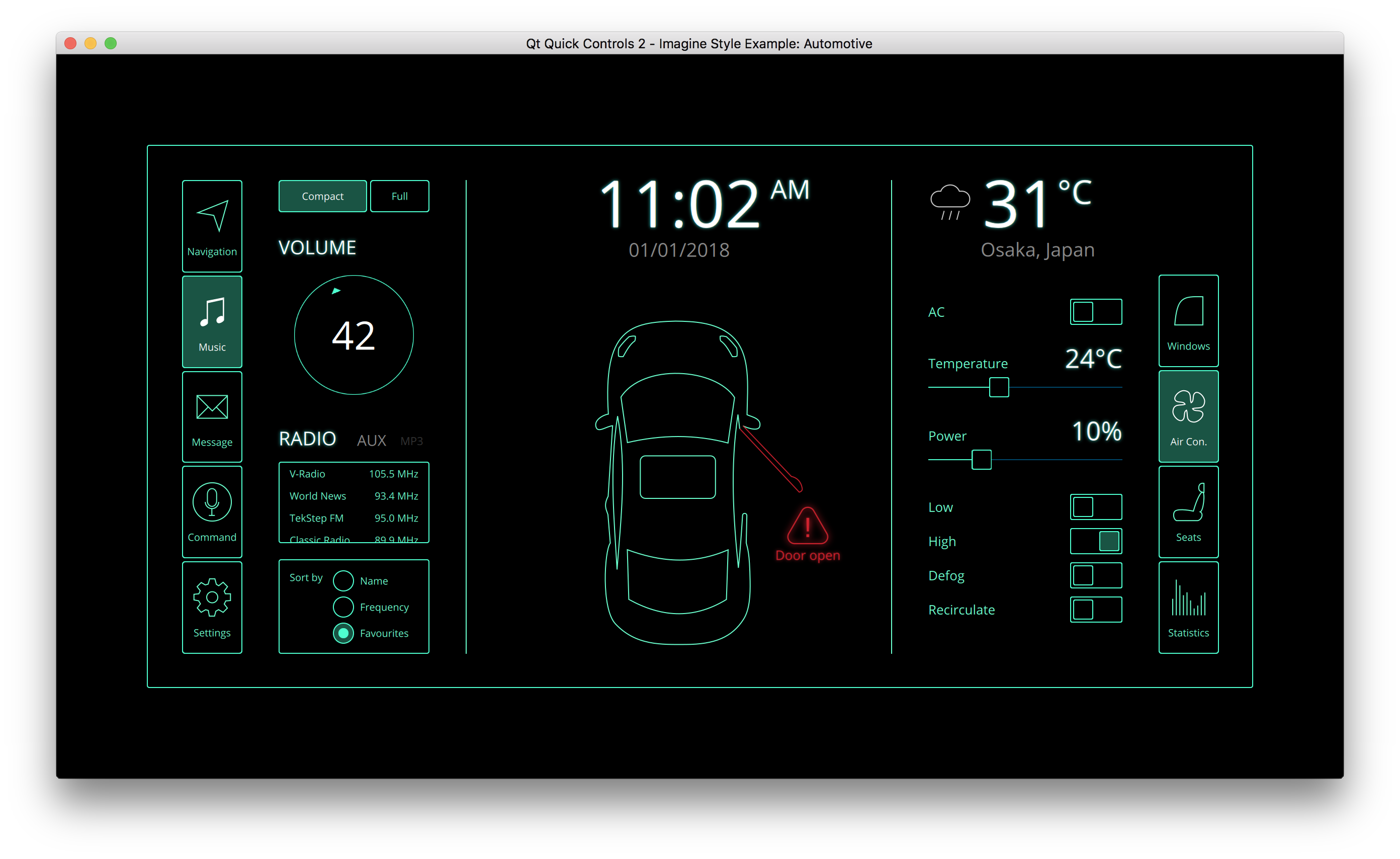 Qt Quick Controls 2 - Imagine Style Example: Automotive (
AI)
Qt Quick Controls 2 - Imagine Style Example: Automotive (
AI)
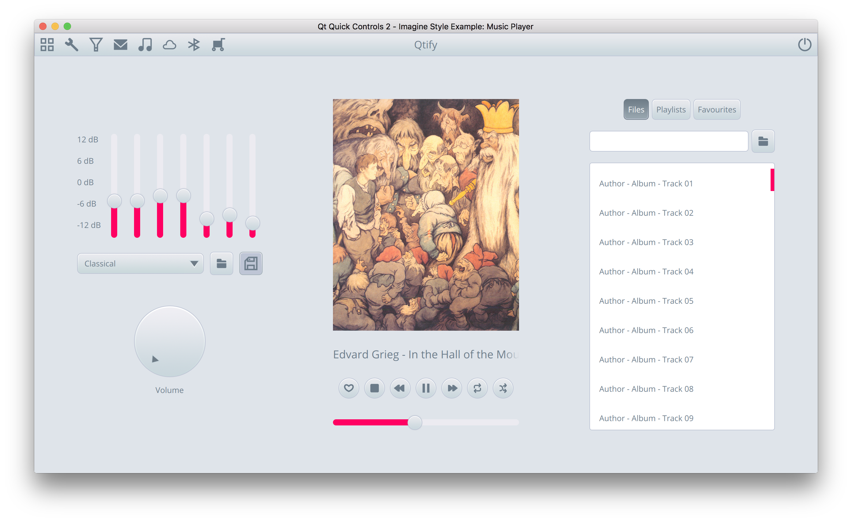 Qt Quick Controls 2 - Imagine Style Example: Music Player (
PSD)
Qt Quick Controls 2 - Imagine Style Example: Music Player (
PSD)
The Imagine style is available with Qt 5.10. For more information, see the documentation.